SNU FactCheck
SNU FactCheck is a fact-checking portal where general people request an issue to be fact-checked and professional journalists fact-check it. This service is the first service in Korea that collects factcheck contents from various sources. At first, it started with 7 media outlets, but now there are 27, including the top 3 broadcasting companies (KBS, MBC, and SBS) and the top 2 newspaper companies (Chosun and Jungang). It was our mission to provide an effective visual summary for the factcheck contents from multiple journalists, which are often likely to be too lengthy to read. Therefore, my team suggested FactMeter, a gauge-like object showing the degree of an issue's factuality. Also, my mission as a front-end developer was to implement the card UI elements responsively to fit various screen types.
Period Jan 2017 - May 2017
My Role Front-end Developer
Client SNU Institute for Communication Research
(sponsored by Naver)
Director Prof. Joonhwan Lee
Vice Director Cindy Oh
Designer Nahi Hong
Back-end Developer Jinsu Eun (Ruby on Rails)
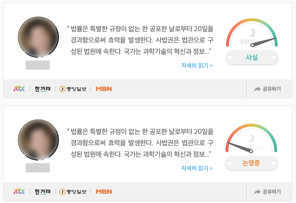
FactMeter

The idea of FactMeter was proposed by the director, and the designer visualized this. My job was to make the FactMeter effectively represent the outcome of factcheck (the degree of uncertainty to which a given topic is fact). Basically, the needle of a FactMeter moves along with the issue's fact-score (1-5). An easier way might be to provide a static FactMeter with the mean of the fact-score. However, the fact-score cannot be pooled because an average score easily ignore how much the factuality of an issue varies. Thus, the needle should represent the distribution of the outcomes, which we chose to animate the outcomes.
There was a trade-off: a short period of time enough to present most of the outcomes vs. a long perioud time enough to recognize (at least glimpse) each outcome. This debate might be a common issue when the movement (speed and direction) of an element is actually a visual variable of a visualization. In order to obtain an appropriate speed of the needle's movement, we tested several spped options with groups of people, and applied the most agreed option to the final system.
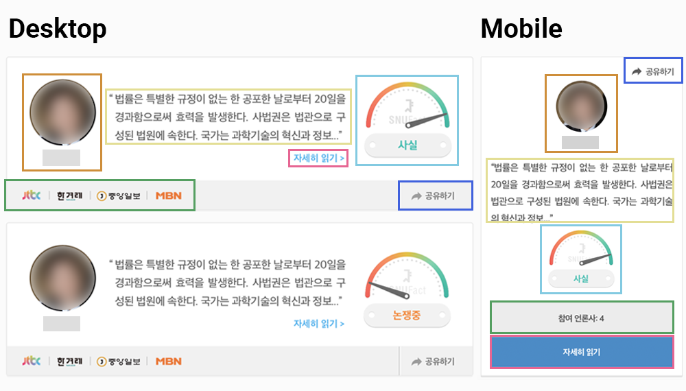
Variation of Card UI

A card-based user interface is often applicable to a system showing a list of many information objects because it flexibly demarcates each piece of information. The cards appear responsively to the screen sizes, enabled by precise and dynamic CSS positioning to match the visual and informational hierarchies.
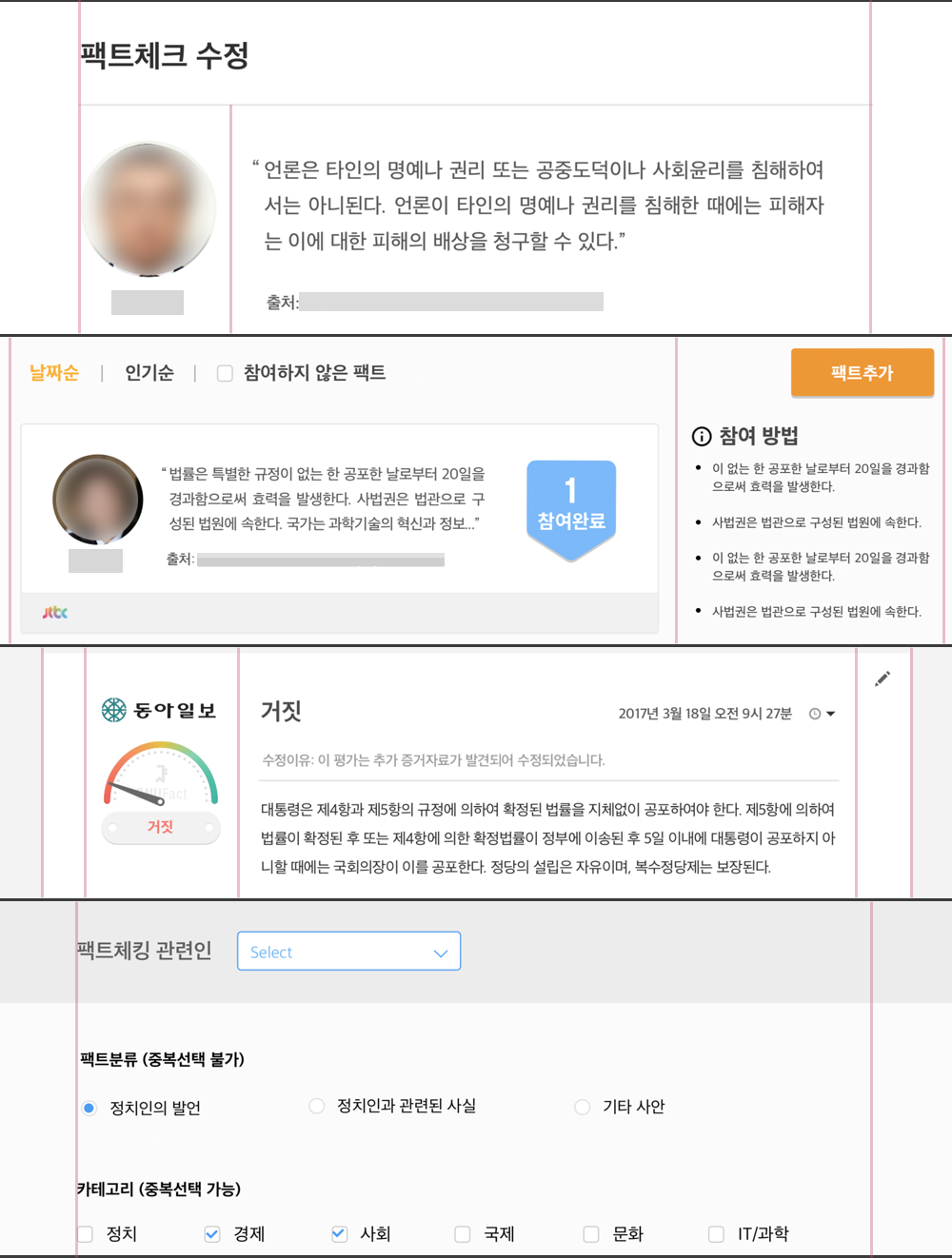
Custom Grid System

A grid system is pervasive for responsive design, and 12-equal-width grid system is conventional. However, the existing Bootstrap and Materialize are often hard to cusomize, while our service required a more flexible grid system. So, I implemented a custom grid system that fit to our card design.