Utopia - Energy Education App
Utopia is a web app for energy education. My team developed user-side and content provider-side applications. The user-side application features an energy diary, a web comics with audio autoplay, and a book viewer system, and the content provider-side application provides management tools for those features.
Period July 2017 - Aug 2018
My Role Director, Front-end Developer
Client Plant (sponsored by Samsung)
Designer Cindy Oh
Back-end Developer Jinsu Eun (Ruby on Rails)
Concept & Communication
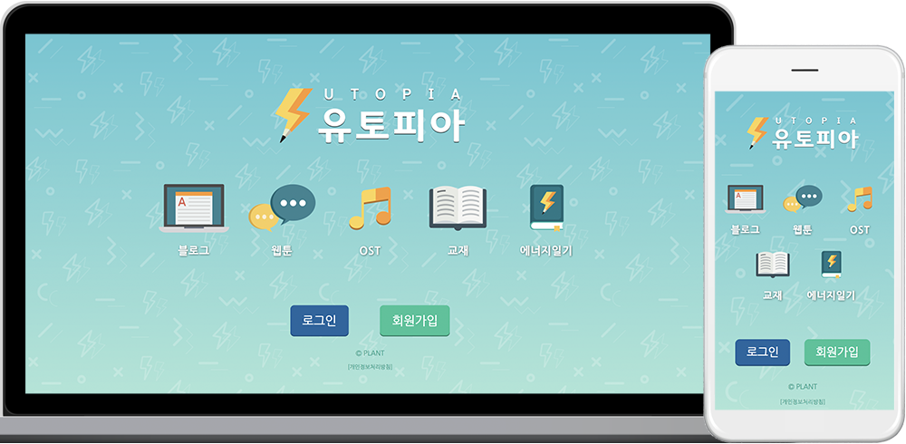
The client of this project was Plant, an energy education start-up. This project started with a vague plan, so it was our mission to deeply communicate and specify the system specification. I led this discussion as the team's director. For example, the originally requested plan was to operate a competitive game based on users's energy usage. However, they had limited maintenance budget and security protections for a longer term, so our team suggested a reward-based monitoring tool.
Energy Diary
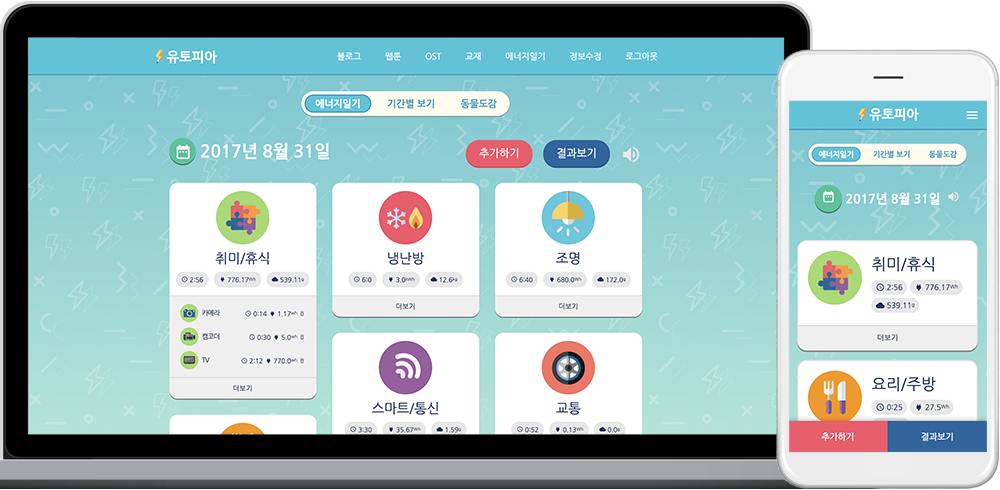
The energy diary was the main feature of this project. A user can record their daily energy use by entering their time of using an appliacne, transportaion, etc. Each card in the diary represents the energy usage of the corresponding sector, and the user can toggle these cards for detailed usage.
Monitoring Energy Diary
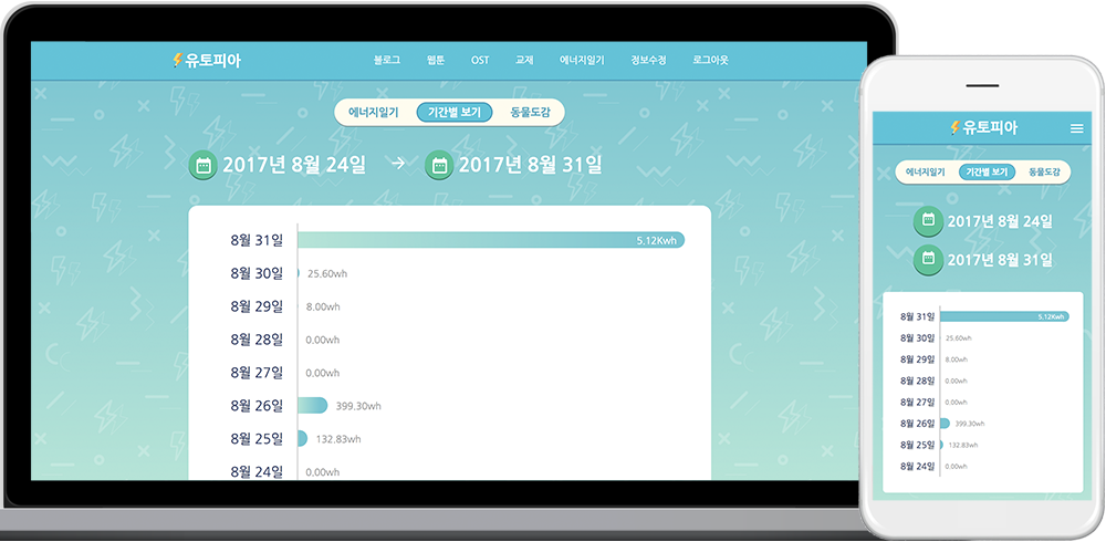
This project was intended to teach students about energy issues, ultimately helping them to reduce energy consumption. As a baseline approach to such a tool, a monitoring panel indicates users about how much energy they have used.
Energy Diary Tutorial
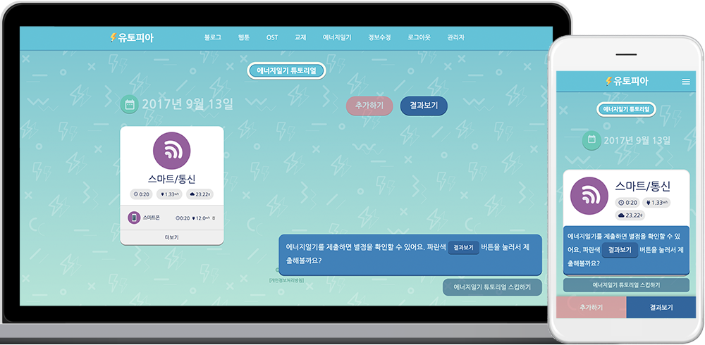
A step-by-step tutorial was necessary to increase the usability of this application among elementary students who were unlikely to be familiar with this system. Thus, a system provides a first-time tutorial in a way that is comprehensible for young students.
Web Comics with Audio Autoplay
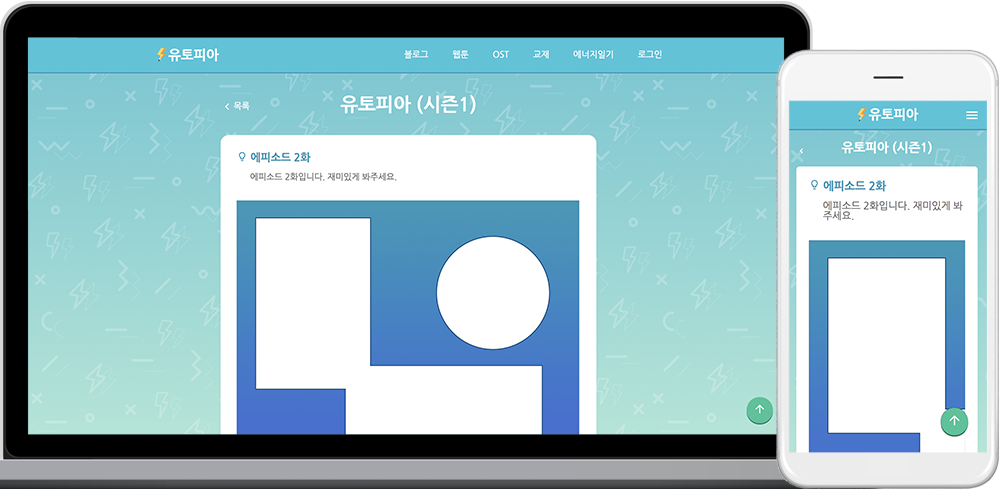
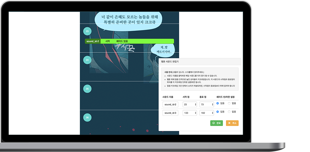
The client requested a web comics (or webtoon) feature with audio autoplay, which means that each audio clip (e.g., background music, and sound effects) is automatically played at specified scroll positions. This way of presenting comics was famous in the Korean web comics market, but it was a proprietary resource, which meant no open source library was available. I developed it from the scratch. I added invisible horizontal grids over comics images for audio cues and utilized JavaScript scroll events, so that audio tracks are played and stopped at their desired scroll position. I concerned with the following two issues in developing the grid-based audio autoplay. First, the vertical height of each audio cue grid had to be relative because the vertical height of a comics image was relative to the screen width. Second, the appropriate interval of the grid needed to be decided because the finer the grid, the more difficult authors to control; otherwise it would be less timely. Therefore, after a few trials, I set the grid size as 100px when the width is 1000px. Second, offering a content provider-side application required an easilty testable interface. When uploading a new episode, the author first uploads the image files of the episode and audio tracks. Then, in another page (the second screenshot), the images are rendered and the grid is visibly overlaid. The interactive dialog box at the bottom allows the author to select the starting and ending points of each audio track, and those points appear on the grid. Fading option was also available for the seamless transition of audio tracks.
Web-friendly Book Viewer
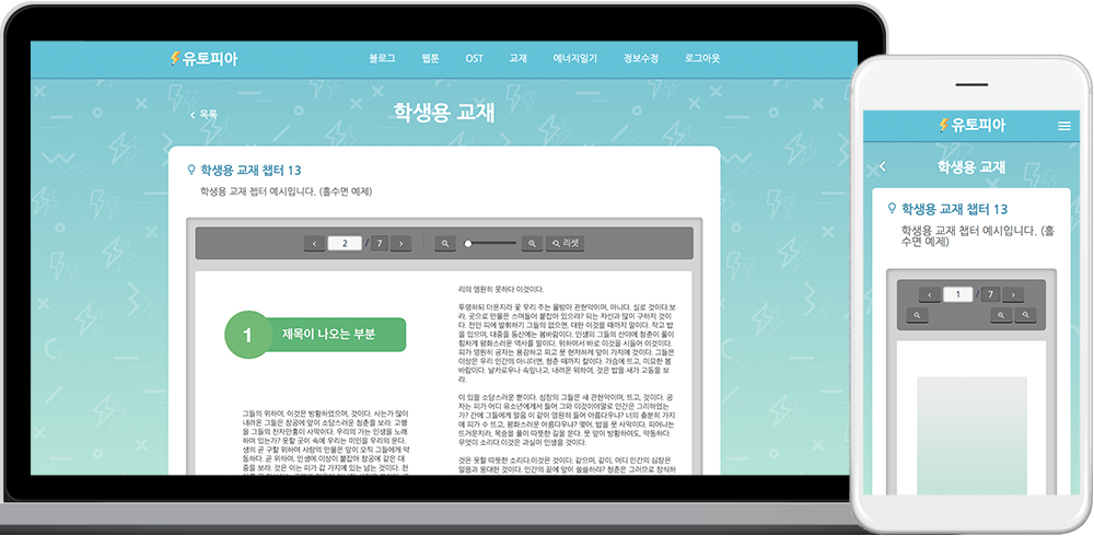
The client wanted to provide the textbooks they developed. Our issue was how to provide the textbooks on both desktop and mobile. The client wanted a page-turn effect, and zooming must be available for user convenience. Moreover, they all had to be web-friendly (without third-party application) for mobile service. Therefore, I used turn.js which is an open-source JavaScript library.